The launcher must feel like a current macOS app first and an Arknights launcher second.
Home#
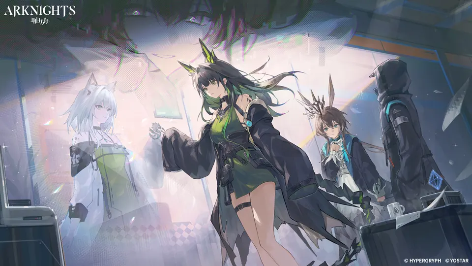
- Let the artwork fill the window and extend beneath the native traffic-light area. Add no title strip.
- Anchor the official Arknights wordmark below the traffic lights at the upper left. Keep the native Settings control at the upper right.
- Keep one compact, capsule-shaped Liquid Glass control bar at the bottom. When a HUD surface expands, use a fixed-radius rounded rectangle.
- Show only the current state, version, and one primary action.
- Show download progress in the same bar. The rail follows the outer pill edge with a protected inner inset. In the compact state, show the percentage first, then transfer size, speed, and remaining time.
Visual language#
- The signal color is a single accent, sampled from the active hero artwork. Use Arknights cyan
#18D1FFonly as the fallback when no dynamic color is available. UseLauncherVisuals.cyanfor that fallback only. Use no other fixed cyan value. - Install, Update, and Play use the dynamic accent as a prominent Liquid Glass tint. Dynamic accents can also mark progress, selection, and interaction highlights. Secondary actions use quiet filled neutral surfaces with a restrained border.
- Get colors from
LauncherVisualsand fonts fromLauncherVisuals.Typography. Do not writeColor(red:or.system(size:in views.
Motion#
LauncherMotion (Sources/ArknightsCore/Shared/UI/LauncherMotion.swift) is the only motion source. Feature code does not use raw curves, springs, or durations. Select a LauncherMotion.Curve by purpose. The DocC comment on each curve states its purpose. Under Reduce Motion, every curve returns no animation. LauncherMotion.fade(reduceMotion:) is the exception. It keeps a short opacity change.
Rules:
- Motion must feel physical and springy. Do not add motion for decoration alone.
- Controls respond at once. A held control uses
press. A released control usesrelease. A hovered control useshoverfor a small lift. - The primary action shows at most one ambient effect. Play shows a static accent halo with one arrival pulse. There is no breathing loop.
- Overlays, such as the update dialog, enter with
presentand leave withdismiss. Native sheets keep their platform lifecycle. - Artwork and theme colors use
crossfade. Settings pages do not animate card insertion. Determinate progress stays linear.
Motion gating#
ContinuousMotion (Sources/ArknightsCore/Shared/UI/Components/ContinuousMotion.swift) drives all continuous decorative motion, such as the progress sweep and the indeterminate pulse. It updates at most 30 times per second. Do not use another timer or animation loop for decorative motion.
DecorativeMotionVisibility closes the motion gate when:
- The app is inactive or hidden.
- The window is not visible, is miniaturized, or is occluded.
- The game runs. This rule applies to every loop, including loops inside sheets.
- Low Power Mode is on.
Rules:
- A closed gate freezes the phase of each loop. The loop resumes from the same phase when the gate opens.
- Reduce Motion also freezes the loop. A caller can set a fixed phase for Reduce Motion.
- The home layer also pauses its loops while a sheet, the update overlay, or onboarding covers it. Loops inside sheets and overlays keep running when the other conditions allow it.
Interaction contract#
The home screen exposes one primary operation at a time. The current state selects its action:
| State | Action |
|---|---|
| Selected server absent or partial | Install or Resume |
| Cancellable download | Pause |
| Newer game manifest available | Update |
| Server ready | Play |
| The server's game session is active | Stop |
These actions reuse one control, never compete as buttons, and secondary controls stay neutral. Update checks never download game data until the user selects the update action.
Each server owns its game directory and installed manifest. The home action and status capsule show only the active server. See Installation architecture and Launch and process lifecycle.
Show a failure in the shared failure dialog. Give actionable guidance and matching recovery actions. For a blocking failure, the status capsule shows Needs attention and a Show Details action. The capsule does not repeat the error text, the support code, or the Rosetta recovery controls. During onboarding, keep the Rosetta prerequisites and the installation recovery in the setup step. Do not turn a transient check failure into an install or play action.
Accessibility and input#
- Give every icon-only control an accessible label and a useful hint. Visible and VoiceOver labels describe the same action.
- Keep settings, gallery items, document links, and modal Done actions keyboard reachable. A focused primary action stays focused when its title changes.
- Use semantic controls, not gesture-only or hover-only actions. Return and Space never trigger Play or Install from an unrelated focused control.
- Respect Reduce Motion, Reduce Transparency, Differentiate Without Color, VoiceOver, Full Keyboard Access, and the largest practical text size. State changes must stay clear without animation, color, or precise pointer input.
- Let English labels wrap. Avoid fixed-width labels and truncation that hides the operation or error name.
Feedback and review#
Use native controls and the shared action families in Sources/ArknightsCore/Shared/UI/Components before you add a feature-local variant. Only a different interaction contract justifies a custom control, not padding or tint. Keep primary emphasis on the current game action. Keep secondary links, settings, diagnostics, and legal text quiet.
For a UI change, use the debug simulator to check an empty and an installed region, an active operation, and a failure and recovery path. Repeat with keyboard navigation, VoiceOver, Reduce Motion, and normal and large text. The release matrix is in Testing architecture.
Modals and popups#
- Use a quiet modal header with a restrained neutral rule. The current operation owns the only prominent action color.
- Keep modal actions in a floating footer with a clear default and neutral dismiss and support actions. Use a second row when they do not fit.
Settings and documents#
- The Settings sheet adapts to the window size.
AppConstants.Settingsdefines its margin and size limits. - Group related controls in quiet Liquid Glass panels. Switch Settings pages at once, without page transitions. The selected rail section uses the dynamic accent.
- Use a list rail for Game, Appearance, Audio, Updates, Installation, Storage, Playtime, and About. Debug builds add Developer. Game opens first.
- Explain destructive or expensive actions in user terms. Keep developer terminology out of the interface.
- Warning and danger panels keep neutral backgrounds. Semantic color is limited to the header, icon, edge, and relevant actions: danger for destructive settings and failure codes, warning for cautionary state, success for completed state, and the dynamic accent for the primary operation and intentional selection.
- Render bundled Markdown as native text, parsed once when the document opens. Tables adapt their column widths and can scroll horizontally. Missing or unreadable documents show an explicit error state.
Dock menu#
- Show a Play entry only for each installed region. Disable every Play entry while a refresh or another launcher or game operation runs.
- Route a Dock launch through the normal refresh and launch guards. Open the main window when the launch does not start, for example when an update, Rosetta, or another recovery step needs attention.
First-run setup#
- Present setup as an operation briefing in the launcher window: a persistent route on the left, one task on the right, and installation status inside the relevant step.
- Check for a newer launcher first. If one exists, stop setup at the update action until the user installs and reopens it.
- Verify functional Intel execution through Rosetta 2 after the launcher preflight. Explain macOS 27 beta-only Legacy Game Test Mode recovery without presenting it as a stable-OS step.
- Walk through System Check, Server, Display, Look, Updates & Audio, and Ready. Ask each question as answer cards (
OnboardingQuestion): one answer, several answers with checkboxes, or action cards that open a chooser. Mark the recommended answer. End Display with a one-sentence summary. - Apply choices immediately through the same actions as Settings. Users can reopen the assistant from Settings → Installation.
- When a release requires returning players to rerun setup, open with a "Something important changed" briefing that explains why, and hide Skip Setup until they finish. First runs stay skippable.
- End with a plain statement that the launcher is an unofficial community project. Route launcher, Wine, and embedded-browser reports to the pre-filled GitHub form. Route account, payment, and game-service issues through the publisher support routing table.
Artwork#
The default image comes from the official Global launcher configuration and is cached locally. Neither the repository nor the DMG includes it. The service exposes one active image, not a playlist. Do not build a carousel from historical CDN URLs.
Notices#
App icon#
The source icon is an Icon Composer document with separate structure, glass glyph, and signal layers. Packaging includes an asset-catalog rendition so macOS 26 does not place a legacy ICNS on a gray backing plate.
An operator preset applies a matched pair, a Launcher icon and a Game icon from the same avatar. Dynamic Theme recolors only a Launcher operator preset, never the Game icon. A local image overrides one destination and ends automatic preset refreshes.
Settings offers one Choose Operator… action for both icons and a Your own images row with one menu per icon.